In my previous post I discussed how declarative design could work…today, I want to show you how it can work.
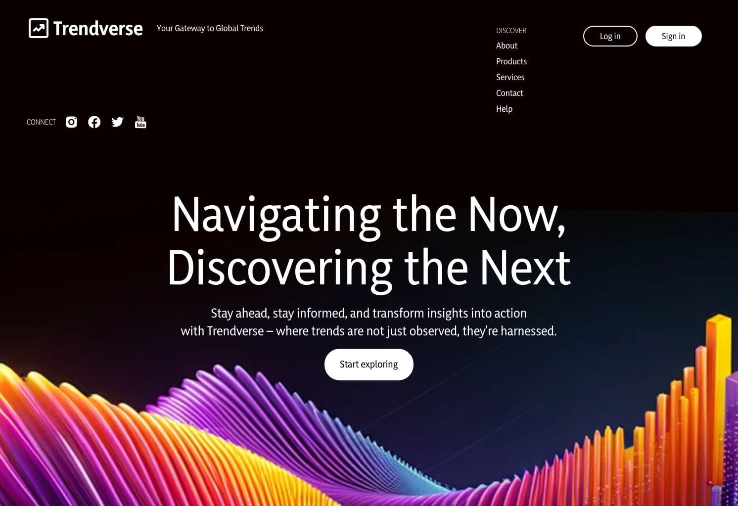
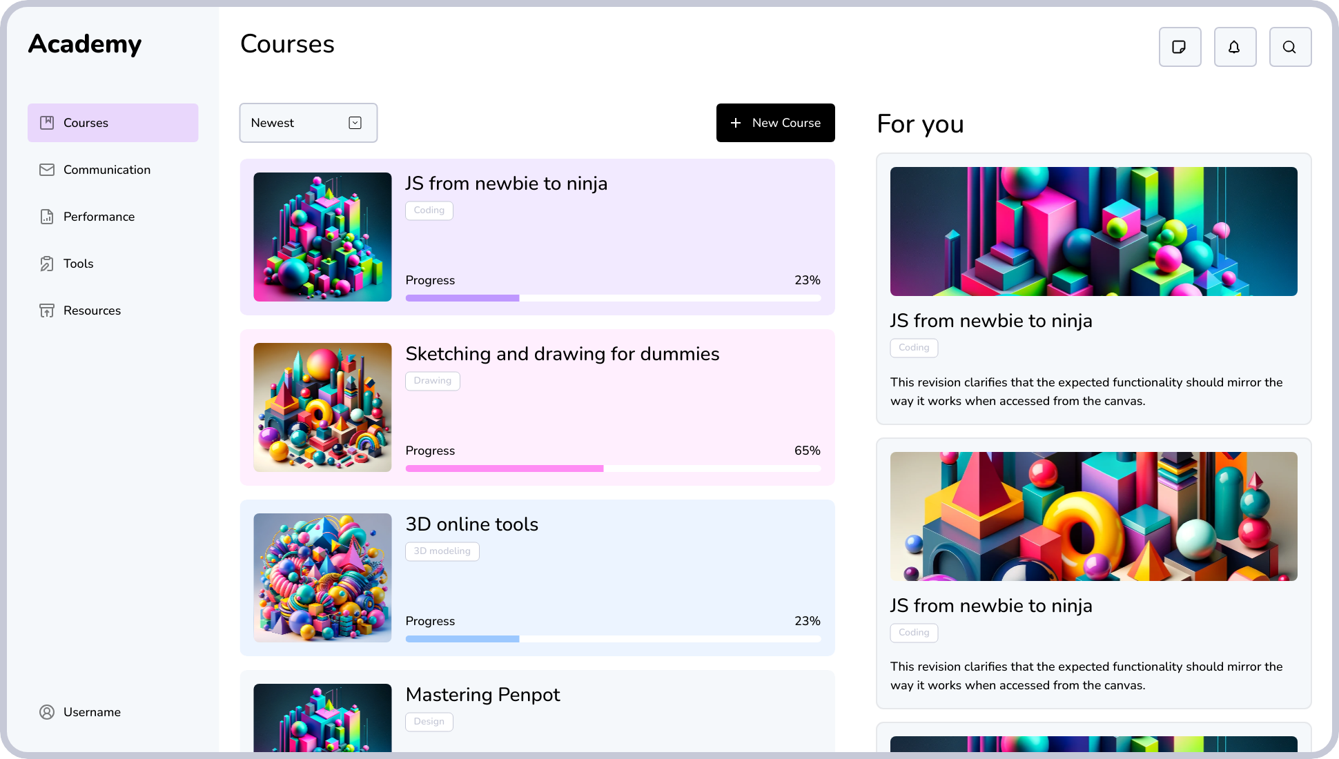
Imagine that you come up with a design for website that looks like this:
From an imperative design perspective, unless you want this to be concept art or a mockup never to become real software you have to extensively document such an interactive user interface for development.
Why? Because, traditionally, software design tools have prioritized the feeling of control even at the cost of effectively bringing the work to life. And, as you might imagine, an obsessive, control-oriented process won’t get you where you want to go. While design tools might frame this process as the pursuit of quality, it’s simply not the case.
The sad result? Most UI designers’ portfolios are a collection of mockups, not urls.
Another collateral effect is that, conditioned as they are, designers will demand “faster horses” and design tools will keep providing just that. This delivery of more control will come in all shapes and sizes, from ways to build and navigate gargantuan design systems to ever more sophisticated ways to comprehensively document design “states” and their (innumerable) exceptions.
A post-horse world
If you’re like me, you’re already starting to feel for that tired horse– so let’s pause for a moment.
CSS has evolved to be a powerful declarative design language. Best of all, it’s ubiquitous. What if a design tool decided to express design concepts like alignment and layout using CSS as its foundational abstraction?
You might consider discontinuing expressions like export, generate or output when referring to the code linked to the design. Hey, you might even consider whether “hand-off” is an accurate term anymore. If we can make design and code be two sides of the same coin, why not just stick to a simpler “inspect”, perhaps?
But let’s not get ahead of ourselves.
When in February 2020 we announced the birth of Penpot, we knew we were enjoying a radically different scenario than those of other design tools.
Today, I want to share with you that we’ve been working on bringing native CSS Grid Layout for UI design for the first time. This is a bold move driven by our mission to unite designers and developers around a common language.
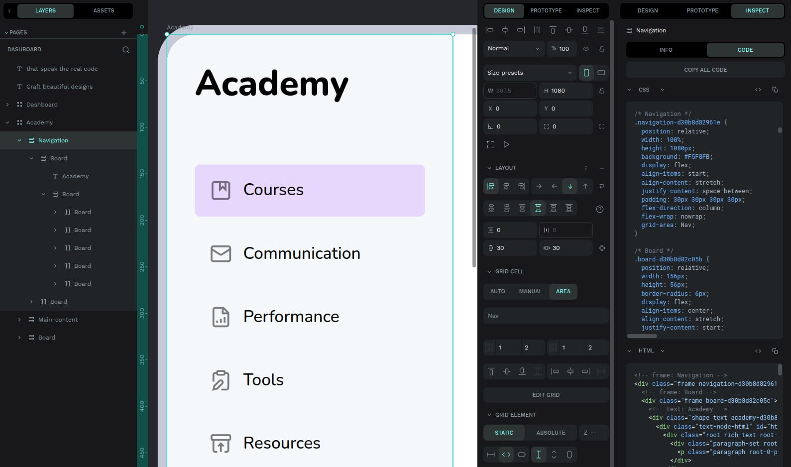
Let’s see what this looks like:
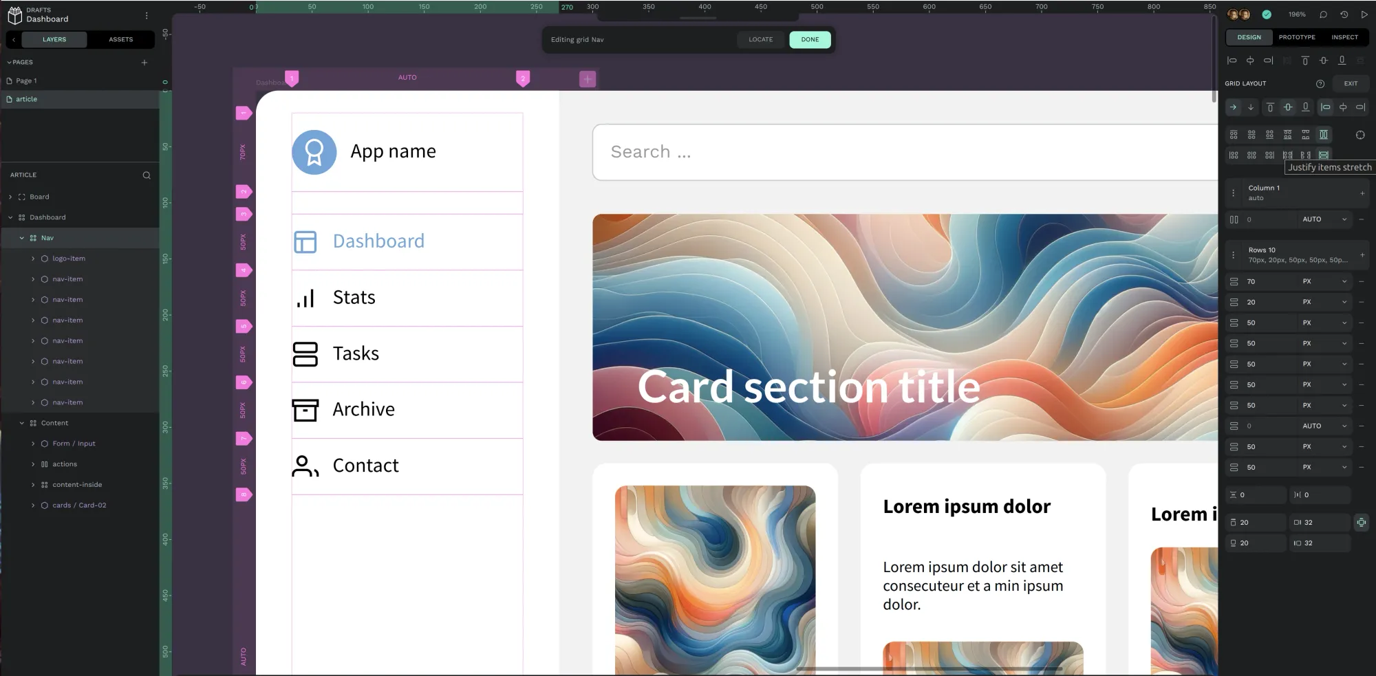
Here you can see what CSS Grid Layout looks like in Penpot. The canvas has contextual information matched by attributes and properties available on the right pane.
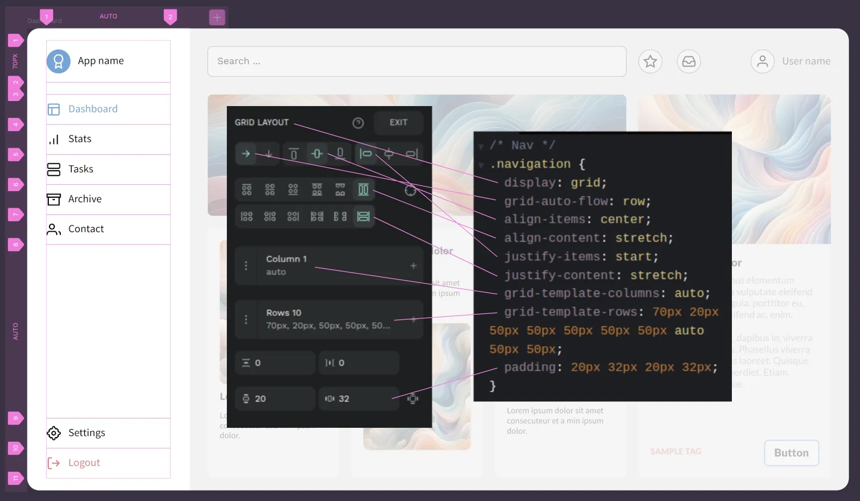
You can see a short clip showing a real-time editing exercise (zoomed in cropped for a better effect).
Design canvas, CSS Grid Layout pane and inspect code, all in one glorious clip
In order to bring this declarative programming power to a declarative design interface, we had to consider not only how a designer would benefit from CSS Grid Layout, but also how all this could be used with CSS Flex Layout and other more traditional layout and alignment options.
Let’s go back to the original app design and focus on the navigation bar. With Penpot, no matter what you build as a designer, there’s always a 1:1 match between design and code.
As an open source tool, we strongly believe in the necessity of co-creating your software with your Community. Once we came up with this idea, we immediately involved the Penpot Community and, after the initial shock, we got more tailwind than we could’ve dreamt of! (no pun intended)
Declarative Design is about freedom
Even if we’re celebrating how transformative CSS Grid layout can be, especially if we integrate it natively in design tools like Penpot, you should be able to use anything you want as a designer.
There’s no such thing as one size fits all and, for any one particular visual output and behavior, there will always be an infinite number of valid paths. It’s you who will make the choices, even if you sprinkle your work with imperative design toppings here and there.
For instance, take a look at the next design. It’s almost identical to the one we already discussed, right?
And yet, the navigation panel obeys different rules. Yes, CSS Grid layout was kept for the overall architecture. But we decided that the main portions should follow CSS Flex layout instead. Let's take a closer look.
Ever since we announced that we had started working on this at PenpotFest 2023, we knew it was going to be something big. We are now almost done with the final details and we can’t wait to know how your design process and collaboration workflows level up! Penpot 2.0 will be released in just a few weeks and comes with much more than CSS Grid layout, but I have to say– this is my favorite mega-feature for what it represents. Stay tuned!
The missing ingredient in design tools: declarative design
In a time when design tool manufacturers are focused on providing a “faster horse”, it's time to consider how to move to a post-horse world.